Tips for Creating Meaningful Logos
From the golden arches to the Nike swoosh, bold logos have taught us to immediately—and often subconsciously—associate distinct emotions and attitudes with the companies behind the mark. Good logos have the power to boost your credibility, establish who you are as an organization and, ultimately, determine whether or not people engage with your brand.
Lucky for us, our team is full of design experts who know that behind every logo is a well-thought-out rationale—a “Why?” that goes deeper than solely looking cool. At Agency 877, we believe it’s important to incorporate intentional meaning behind every logo we create to help our partners showcase their values and make a bigger impact on their audience.
Here are some logo design tips from our team!
Keep it Simple
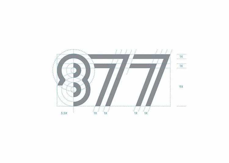
Don’t make things harder than they have to be. Many of the world’s best, most recognizable logos are clean and uncomplicated. Some marks are simply comprised of the brand’s name or acronym in a distinct font. Some are a standalone symbol—like an apple, a shell or a bullseye—that people associate with the organization instantly. So, while you should make it a point to give your logo plenty of meaning, don’t make it look messy in the process.
Make it Memorable
A memorable logo stands out from the rest, and that means avoiding the obvious. If you’re a cheeseburger restaurant, don’t put a cheeseburger in your logo. If you’re a company that sells natural or organic products, don’t use leaves. That’s all been done before. It may take a few tries before you get there, but stay away from cliches to ensure your mark is unique, distinct and memorable within its market.
Reflect the Brand
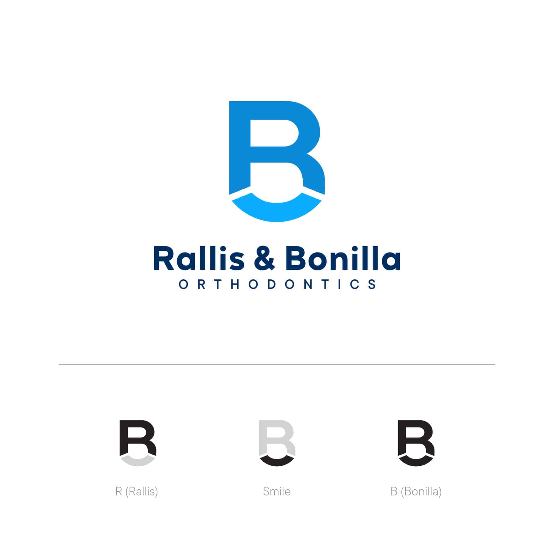
It’s absolutely crucial for us to research and familiarize ourselves with a brand before we dive into design. Some companies are modern and clean-cut, which means we shouldn’t use a scrolly, vintage font and dull colors to portray them. Some brands are classic and traditional, which means a skinny, sans serif font paired with lime green might not be the best fit.
In sum, we take time to get to know the brand and what it stands for. We choose our fonts and colors carefully. Typography matters; shape matters; different shades of the same color matter. This mark will become the encapsulation of the company’s identity, so we always strive to make it match their vibe.

Tell a Story
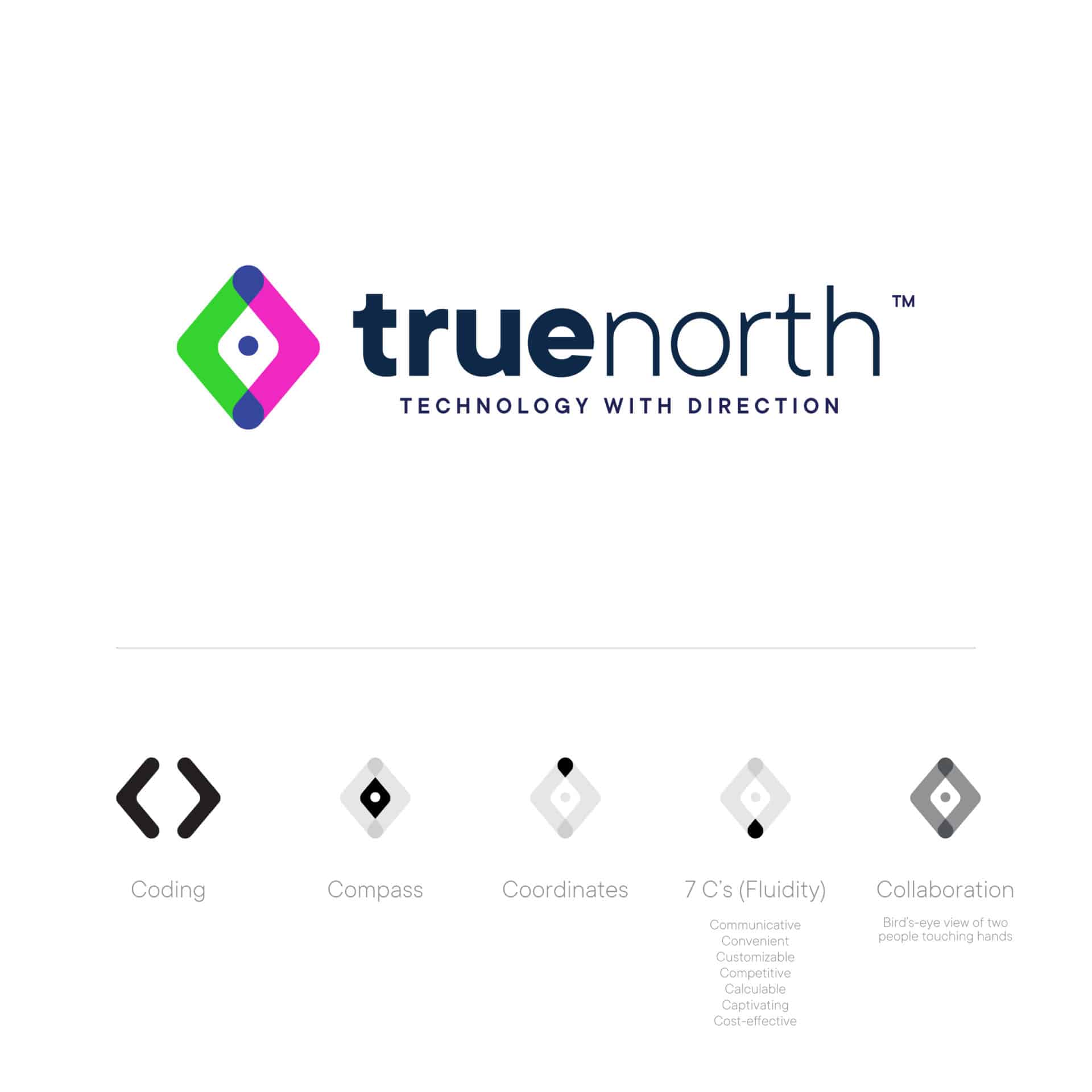
When it comes to giving logos a deeper meaning, personal touches are key. Being able to incorporate company values, symbols, keywords and names into logos is the difference that blows our partners away every time and shows them we care. Hidden personalization is the “wow factor” behind every mark, and it makes it easier for the company to tell its story to customers. For example, even though this concept for True North Technologies looks incredibly simple from the surface, there’s multiple levels of meaning hidden beyond the obvious.
And, don’t forget:
Make it Timeless—your logo should look good now, five years from now, a century from now…avoid trends, as they become irrelevant quickly.
Keep it Scalable—whether it appears on a letterhead or a billboard, your logo needs to translate seamlessly to different sizes.
Give it Balance—for aesthetic purposes, keep the weight of graphics, colors and size equal on each side. Make sure it’s easy on the eyes to appeal to the general public.
Keep these logo design tips in mind, and show us what you come up with in the comments!

