PROJECT OVERVIEW
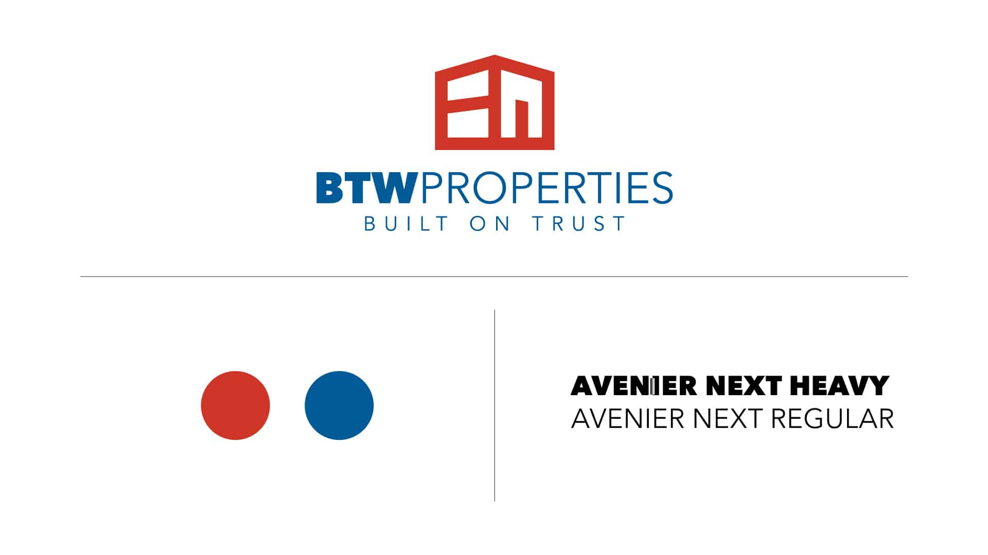
The BTW Properties name is a combination of Barb and Tony Wald, the family who owns our parent company, TOBA. They asked us to develop a brand for their commercial and residential real estate business that was professional, yet approachable.
THE CHALLENGE
We didn’t want to come off as too small for the commercial and industrial clients or too large for the everyday, individual home-buyer. Our goal was to create a balance between the two that was built on trustworthiness, relationships and reliability.

Branding

Design
LOGO
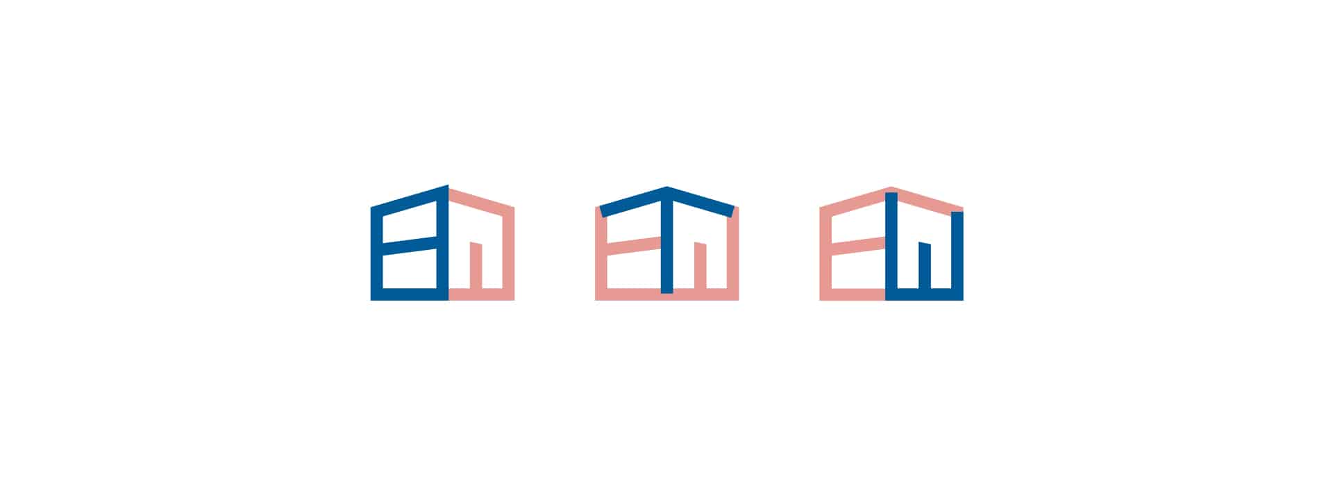
The BTW Properties logo is an ambiguous building structure that cleverly incorporates the brand’s key letters: B, T and W. The typeface also emphasizes the letters, and the all-caps font represents strength and stability.
