PROJECT OVERVIEW
Up in Smoke is a Hastings, Nebraska-based food truck that serves up fresh, chef-quality barbecued meats. From pulled pork to burnt ends, these meats are the real deal, slow-smoked over hickory pecan wood until tender, then paired with homemade sides and served from a portable truck. But first, they needed a brand. Our team defined their audience and competition, then delivered a top-notch logo, custom drawings and a purposeful messaging platform.
THE CHALLENGE
The founder of Up in Smoke had an interesting culinary journey, so we made it our mission to tell that story through both the visual and written aspects of the brand. We also wanted to give off an upscale, gourmet and large-scale vibe that isn’t usually associated with the convenient, affordable image of a food truck. Our team worked closely with the owner to develop a brand that looked classy, but not too fancy, to bring his lifelong dream to life.

Branding

Hand Lettering

Design

Environmental Design
LOGO
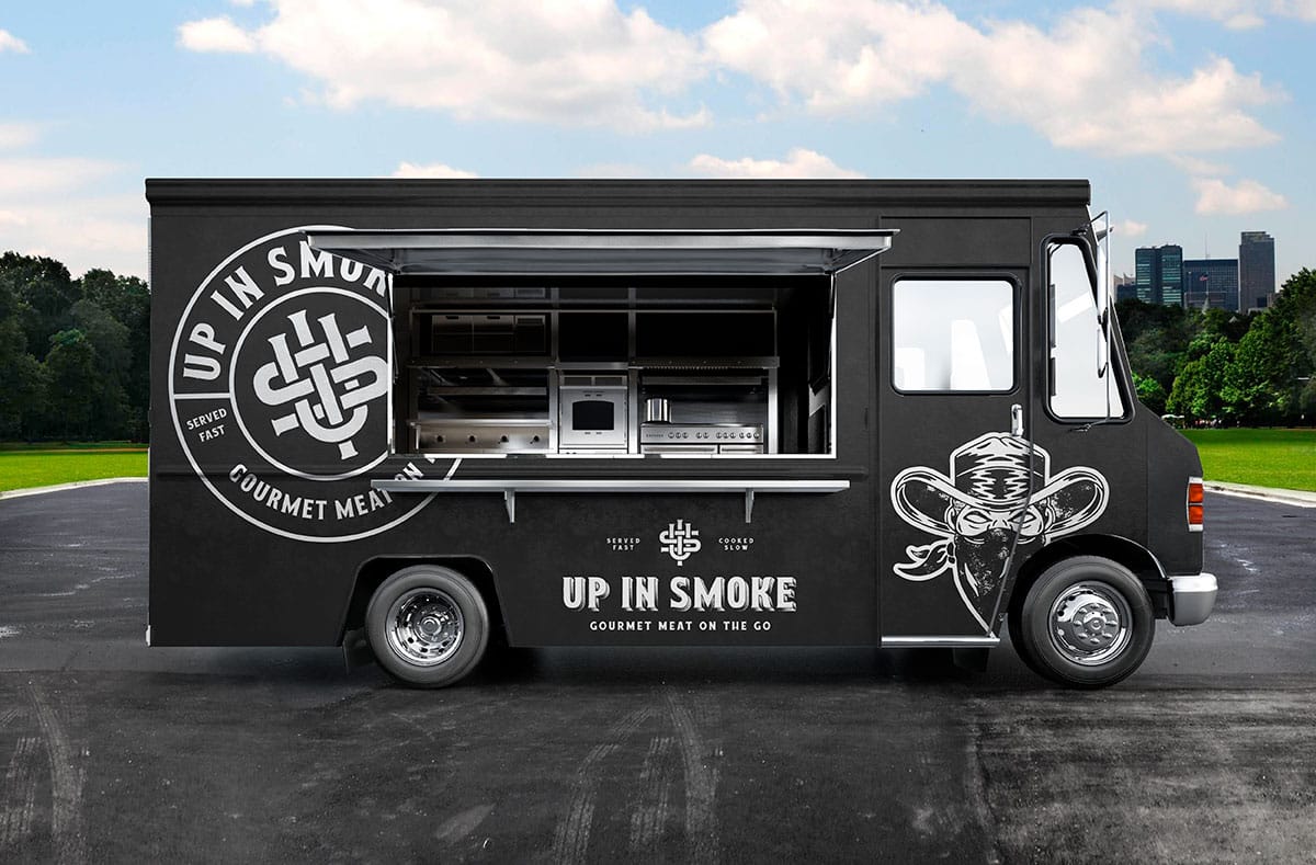
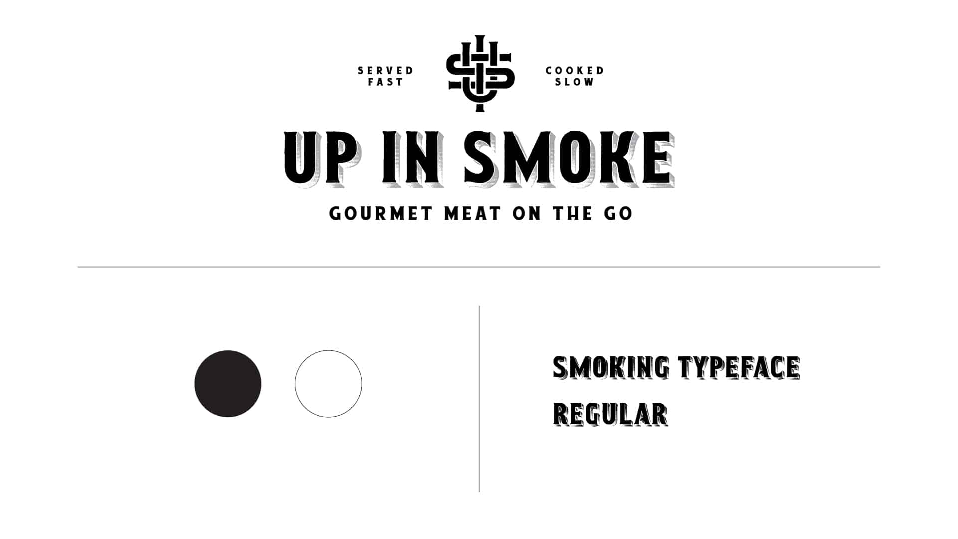
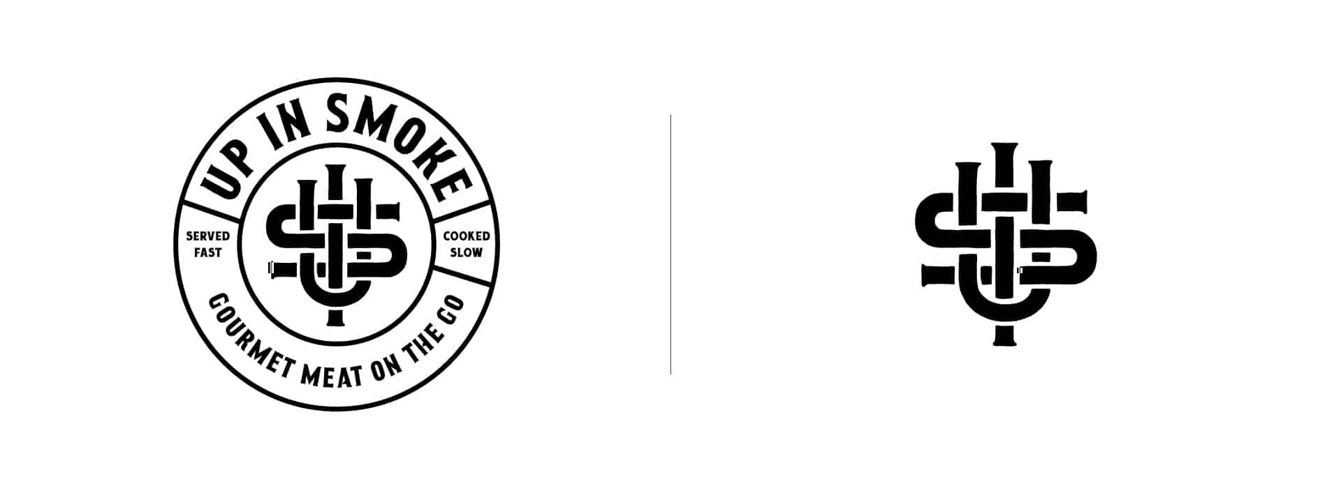
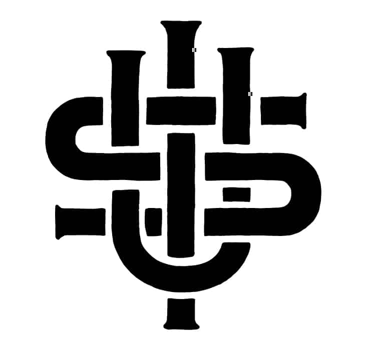
The Up in Smoke logo makes it clear that this isn’t your average, small-town food joint — they should expect an executive-chef level of quality from this place. Aside from containing the letters U, I and S for “Up in Smoke,” this monogram has some hidden meaning. It represents the grates on a grill, a skewer going through meat, and smoke “weaving” its way in and out of the food truck.
MESSAGING
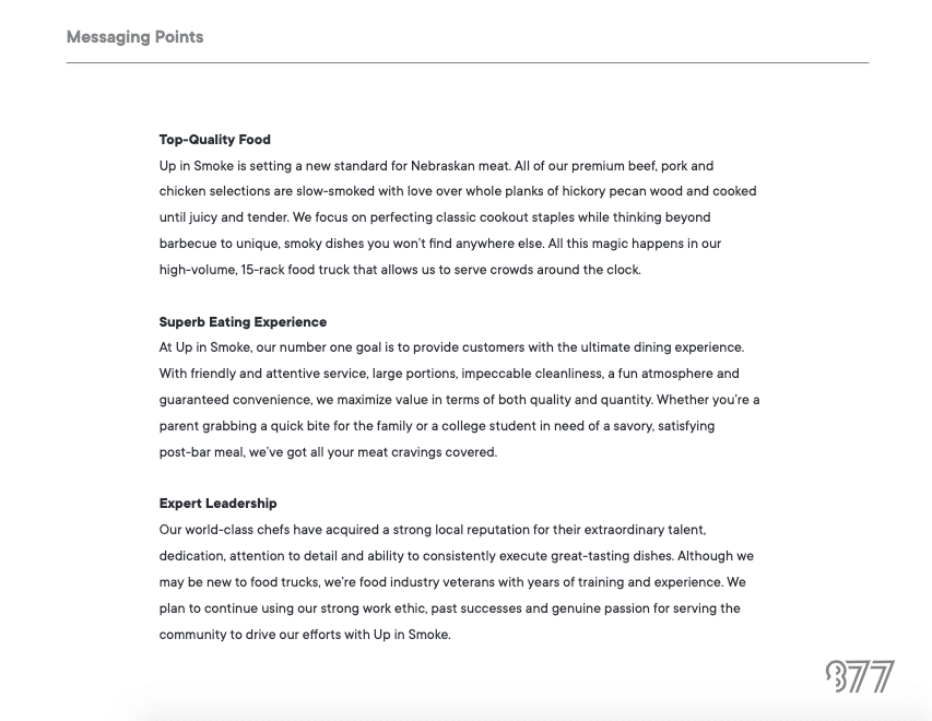
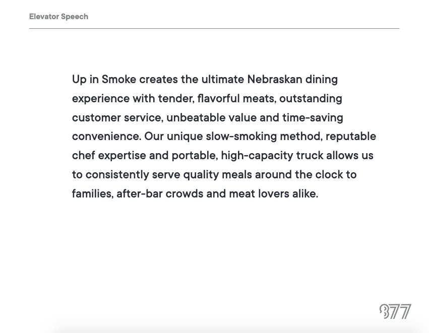
The Up in Smoke experience was condensed into three points: top-quality food, superb service and expert leadership. From there, we developed an impactful brand promise, as well as a short, yet effective tagline that immediately helped passersby understand the purpose of the business.
ILLUSTRATION
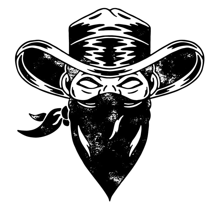
We drew these designs by hand in Procreate to give the Up in Smoke brand an authentic touch. The bandit, specifically, intended to represent the owner, who was a “culinary bandit,” always on the run and traveling far and wide in search of the food industry’s next big thing.
ENVIRONMENTAL DESIGN
There’s nothing like a seeing the brand displayed on a food truck to really put it into action! We knew customers would gravitate to the bold, black and white coloring, oversized logo graphics and sleek, modern layout.
